It has been almost four years since LCP Delta published the industry’s first-ever asset leaderboard. Designed through Enact – our market leading real-time power market tool – LCP Delta aims to help asset owners quickly compare and understand their performance and strategies against their competitors.
Since then, the GB market has grown exponentially, with a surge in the number of assets, owners, and optimisers. Now, a leaderboard’s use is no longer limited to those actively participating in the market, but also those observing market performance or investing in assets. Yet, if you speak to anyone in our team, they will tell you that solely relying on any leaderboard – including our own – is fundamentally flawed.
We delve into why asset optimisers currently ask the question: “Do I want more achieved revenue, or more leaderboard-visible revenue?”

The role of asset leaderboards
The energy market is becoming increasingly competitive and complex. The emergence of new markets with differing time horizons makes the strategy employed by an asset crucial to its performance. Powerplant owners, therefore, often entrust third-party or in-house traders and optimisers to manage their assets and maximise their revenues. This strategy is most recently relevant in the context of battery asset management.
Leaderboards provide a useful way of benchmarking market performance and performing simple analyses, while prompting questions on not how well an asset did, but why – identifying areas for drilling deeper into the detail. After this, other tools equip the market with the tools needed to answer those questions.
For example, the revenues of large thermal assets are often dominated by wholesale and balancing actions. Subject to the assumptions we discuss below, you can compare raw revenue differentials with a high degree of accuracy. By looking at a particularly tight day, or over a range of time, a leaderboard can be a useful place to see which assets are gaining the most value from the markets they are in, and then drill into the why and how.

On the other hand, when comparing storage assets, it becomes evident that the battery revenue stack can be considerably more intricate. While traders managing traditional assets might primarily focus on maximising profits in day-ahead, intraday, and balancing markets, optimisers on the other hand contend with an ever-changing array of markets to navigate. Comparing storage assets to thermal assets on the same day reveals stark differences in the strategies employed.

Looking at storage above, some assets locked in their revenue month-ahead through the Firm Frequency Response (FFR) market, as demonstrated by the successful strategies of the Minety and Pelham batteries. In contrast, other assets deferred that decision to real-time, concentrating on the day-ahead dynamic market or the wholesale markets.
Examining a single asset over two months illustrates how these strategies play a tangible role in the reality of optimising an asset:
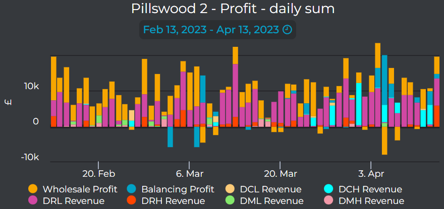
The Tesla-optimised Harmony battery, Pillswood 2, exemplifies this point. As shown above, it operated predominantly in Dynamic Regulation Low (DRL) and the wholesale market (accounting for ~80% of its Enact-assumed profit). However, on April 5, 2023, it altered its strategy by scheduling to charge in the wholesale market, and subsequently being accepted by National Grid ESO to discharge in the Balancing Mechanism (BM).
Case study: morning peak 7th September 2022
We’ve seen above what a leaderboard can show, but what does it miss? Looking at 7 September 2022, a typical day, demonstrates this. Despite relatively low system prices in the Balancing Mechanism in the morning, some storage units could have captured large revenues. We demonstrate this with the Habitat-optimised Gresham House battery, Red Scar.
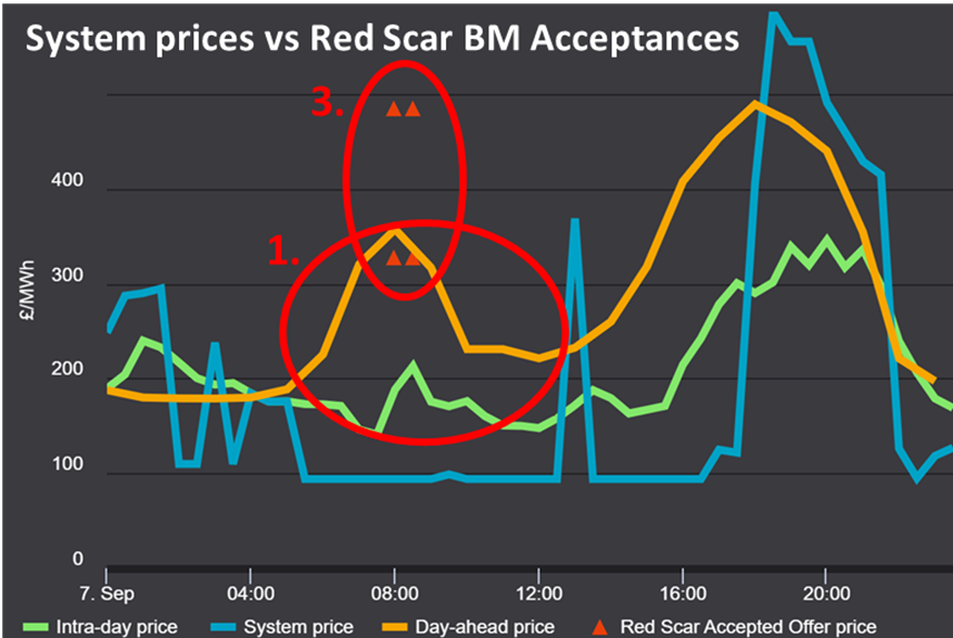
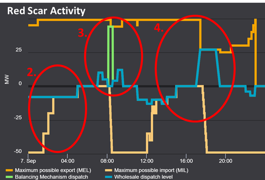
- Units that sold their power at high day-ahead prices for the morning peak were able to buy back their power at lower intra-day prices. This locks in some trading revenue and allows the asset to use its volume elsewhere or even not run at all.
- The Red Scar battery recharged in the early hours, in anticipation of the morning pick up.
- It then discharged both in the wholesale market and in the Balancing Mechanism. In the latter, it had its turn-up offer accepted at a higher price than the market-wide day-ahead price. This way, it earns more revenue by reoptimising twice during the day as opposed to maintaining the day-ahead strategy.
- The battery then went on to recharge during the day in the wholesale market, and discharge as usual during the evening peak.
The above is a possibility for what could have happened, and if it did, the market would not have been able to see the revenue earned through this intraday reoptimisation. A leaderboard cannot accurately reflect this, and we will see below where else they are lacking.
Why do leaderboards fall short?
The term “leaderboard” can be misleading, as it does not offer a fair ranking of the market. Leaderboards serve as a starting point, but a significant portion of the strategy of an asset remains hidden.
Speak to any optimiser, and they all share a common frustration: the market and investors use leaderboards to evaluate an asset’s performance, yet these tools are inherently imprecise as achieved revenues remain concealed, known only to the optimiser. Therefore, a trader can either optimise an asset to maximise overall profit, or put their asset higher on a leaderboard by taking a more transparent strategy. Clearly the former is the goal and relying on market transparency data has its limitations.
With that in mind, here are three ways a leaderboard falls short:
1) Assumptions
While some assumptions may be reasonable and data-driven, they inevitably create a skewed view of every asset. For example, in the Enact leaderboard, our users can choose their wholesale price assumption, but that is still a blanket value we assume the market price achieved for a plant’s wholesale volume, and the commodity cost incurred by an asset (e.g. when and at what price did a plant buy its gas?).
On March 7 2023, GB system prices soared to £1950/MWh. However, on this day, all day-ahead markets cleared around £200/MWh, with Dynamic Containment being especially poor. The market simply did not understand the risk/reward ratio at this time. However, most leaderboards assumed a day-ahead auction price which severely undervalued assets on this day. While Enact lets you choose this, even assuming within-day trading would have “only” achieved £1000/MWh. Whichever assets left their volume to cashout (the system price) would have benefitted significantly more than any real-time leaderboard would show.
2) Hidden Activity
For an accurate picture, the available information on plant volumes is insufficient. In the wholesale market, assets only report their final position i.e., Final Physical Notification (FPN). The details of how they traded their volume ahead of delivery remain anonymised. Consequently, when an asset optimises intraday, hedges ahead of time or engages in Net Imbalance Volume (NIV) chasing (i.e. spilling their power at imbalance), a leaderboard fails to accurately reflect these activities.
3) Real-world Assumptions
Real-world, asset-specific assumptions are not considered. Contrary to what most leaderboards aim to present, each asset has a unique short-run marginal cost (SRMC), which includes any start-up costs and will be lower the more efficient the asset. For storage assets, individual cycling strategies and varying degrees of degradation come into play
For example, an asset can earn higher revenue by cycling more intensely, say averaging two cycles per day instead of 1.5, but this comes at the expense of faster degradation of the asset. Optimisers, therefore, seek to maximise not only immediate revenue also but future earnings may be favoured because they involve less cycling, thereby prolonging the asset’s lifespan and delaying the capital cost of refurbishment.
These shortcomings do present real differences when looking at how well an asset is performing. Jonathan Bosch at Open Energi demonstrates this about one of the Zenobe battery assets they optimise – Hill Farm.
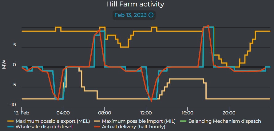
“The Open Energi view of an asset dispatch on 13 February shows a mixture of Dynamic Containment and wholesale trading, delivering just under 1.6 cycles of throughput for a 10MW/12MWh battery. OE obtained an overall 40% trading uplift compared with the leaderboard by trading mainly at the half-hour auction (+23 £/MW) and also leaving some optimised volume delivery to cash-out (+20 £/MW),” Bosch said.
Leaderboards should not be considered definitive reports of market activity. Instead, they merely provide a surface-level glimpse into market trends and performance. While these tools can offer valuable starting points for analysis, they are inherently limited by assumptions, incomplete information, and a lack of consideration for asset-specific factors. While a leaderboard can help you compare and contrast assets and optimisers, they shouldn’t be used to make decisions.
Therefore, it is crucial to approach leaderboards with a critical mindset, recognising their shortcomings while using them as a springboard for deeper investigation and more informed decision-making with tools like Enact.
To learn more about how you can dive into and beyond the Enact leaderboard, get in touch here.


